


Transactional emails are some of the highest engaged emails an Ecommerce merchant will ever send to their customers.
60-80% open rates
10-20% click through rates
Up to 10x as effective at driving visitors back to site post purchase than marketing campaigns.
What is it about these emails that make them so effective at driving engagement?
In this post we will:
- Unpack the anatomy of a great transactional email
- Highlight 3 best-in-class customer examples
- Give plenty inspiration along the way that you can implement into your own transactional emails immediately.
What is a transactional email?
Put simply: Transactional emails are the messages that get sent out to your customers after they make a purchase, providing helpful information about their purchase and often invite the customer back to a tracking page.
For a more in-depth answer, we recommend you check out our entire guide to transactional emails.
Today we’ll be taking a look at three Wonderment customers, Full Leaf Tea Co., Schoolyard Snacks, and Aura Bora.
Full Leaf Tea Co.
Our first example comes from Full Leaf Tea Co., a high quality loose leaf tea and matcha company.
What we love about this email ❤️
The "helpful" information
- Clearly tells the customer when their package is going to arrive, helping to frame better expectations around delivery windows.

- Informs the customer which carrier will be bringing their package

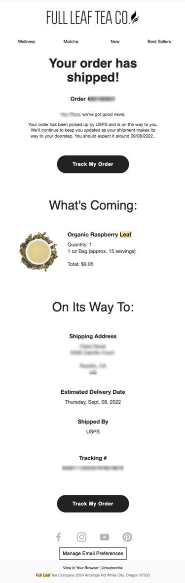
- Summarizes the customers order and clearly displays what will be in the box. This is especially great if a customer might have a split shipment with multiple packages arriving.
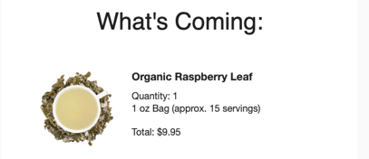
- A clear CTA (call to action) button that reads “track my order” and links the customer to Full Leaf Tea’s branded order tracking page. The tracking page link is vital to kick off the next part of the transactional journey, which brings them back to your site and increases on-site engagement.
The "Extras"
- Header that introduces all of Full Leaf Tea’s other products and invites the customer to browse around. A great way to "soft sell" without being pushy post purchase.
Summary: This email clearly communicates all helpful information, invites the customer visit the order tracking page for more information, and offers one soft marketing promotion by highlighting other products Full Leaf sells.
👉 Simple. Helpful. Highly effective.
Schoolyard Snacks
Schoolyard Snacks is a CPG snack brand who offers old school snacks made the new way: low card, keto approved and with high protein.
What we love about this email ❤️
The "Helpful" information
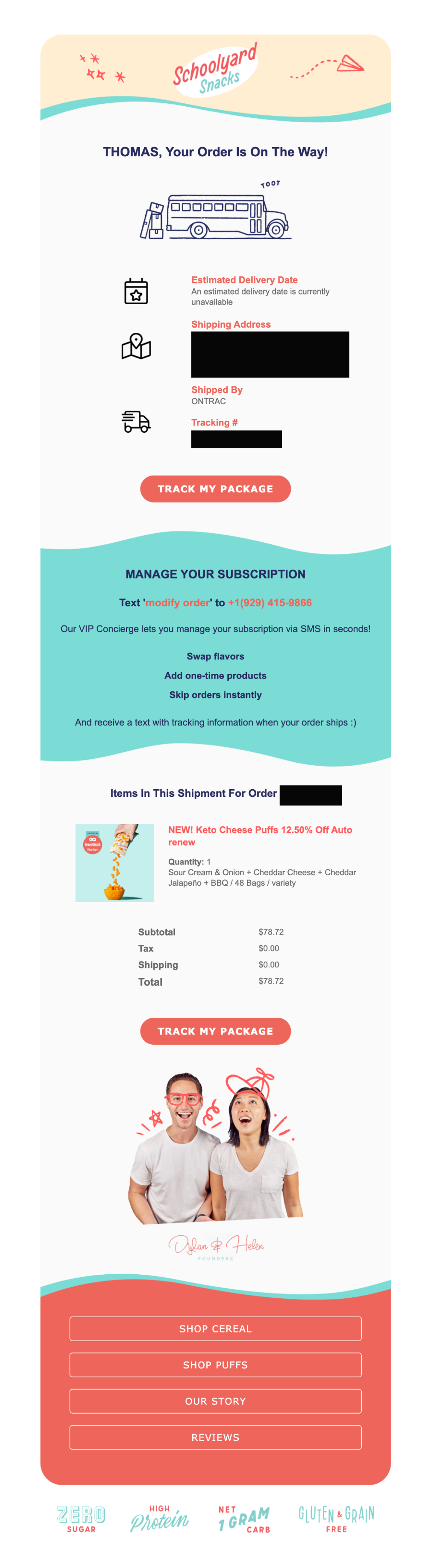
- Clearly communicates to the customer that their order has been shipped and is on the way (building pre-arrival hype!). The fun image of the bus delivering the package is also a clever use of branding.
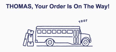
- Summarizes the customers order and clearly displays what will be in the box. It also clearly shows that this is a subscription order and displays the full pricing break out.
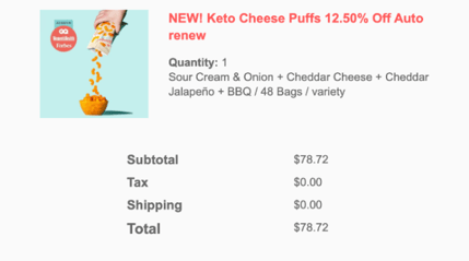
- A clear CTA button that reads “track my order” and links the customer to Schoolyard Snacks branded order tracking page. This again, kicks off the next part of the transactional journey for the customer where they can come back to site, track their order in real time, and find other helpful information.
The "Extras"
- Leverages lot's of on-brand colors and images to captivate the customers attention. This is a fantastic example of how we can use our brand voice and image and inject it into the email experience. If up to 80% of your customers will be looking at these emails, it's important to ensure you put the best foot forward.
- Reduces buyers remorse by reminding the customer of all of the amazing value props that their snacks offer. Again, if up to 80% of customers see these emails... it's a great way to leave those bread crumbs and remind them of the "why".

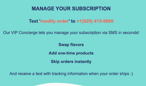
- Reduces subscription churn by informing this subscription customer of how they can manage/modify their subscription via SMS - and even get a text when your next order ships 😉.
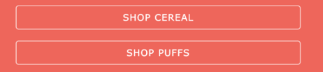
- Introduces a tasteful soft sell by offering customers to view other best-sellers. Love love this.
Summary: Schoolyard snacks leads with lots of helpful information for the customer and then takes it a step further by using the email real estate to inform customers about how to manage their subscriptions, remind them of all of the health benefits their product offers, and even shop other best sellers. It's also worth noting how the colorful design and images immediately create brand recognition with the customer.
👉 Branded. Helpful. Aimed to reduce buyers remorse.
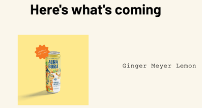
Aura Bora
Aura Bora is a sparkling water brand who uses real herbs, fruits, and flowers for earthly tastes and heavenly feelings. 0 Calories, 0 Sugar, 0 Sodium. (A true staple in many Wonderment employees fridges 🙂).
What we love about this email ❤️
The "Helpful" Information
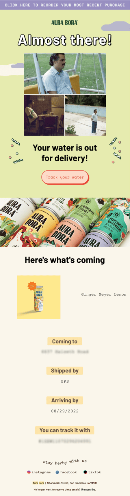
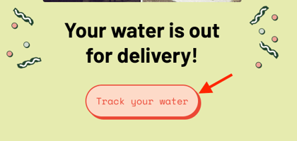
- Clearly tells the customer when their package is going to arrive and gets them excited for the package to be arriving today.

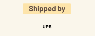
- Informs them which carrier will be bringing their package... so if the customer happens to be looking out for delivery, when they see the UPS truck, they'll instantly know their Aura Bora is on the truck.
- Summarizes their order and clearly displays what will be in the box. Again, similar to our last two examples, clearly frame what is coming.
- A clear CTA button that reads “track my order” and links the customer to Aura Bora’s branded order tracking page.
The "Extras"
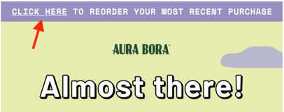
- The top of the email features a “click here to reorder your most recent purchase” button. This link takes them directly back to checkout to place another order. If you are a CPG brand or sell replenishable goods, this is a game changer. You are taking some of the most highly opened/engaged emails and displaying an easier way to reorder. A true win-win for both you and the customer.
- Fun imagery and branding takes this email to the next level (Pablo Escobar is eagerly awaiting his Aura Bora… or at least I can imagine Pablo enjoy a refreshing can of Cactus Rose 😏).

Summary: Aura Bora, similar to our last two examples, leads with helpful information (sensing a theme by now? 😉) but layers in some additional elements to their email that really give customers a look and feel into the companies fun aesthetic. The "reorder" button at the top of the email is a fantastic way to introduce an easy way to come back and buy again, demonstrating how we can use transactional emails as a sales tool.
👉 Informative. Fun. Highly engaging!
So... let's summarize what "great" looks like one last time.
As you can see, each of these emails offers a different flavor of the transactional experience.
From simple yet effective (Full Leaf Tea Co.) all the way to full-on branding with ways to easily reorder (Aura Bora)... each demonstrates how the transactional email is anything but an afterthought.
Here is what all 3 examples have in common
- Lead with helpful information for the customer (what they ordered, when it will arrive, with what carrier, and a link back to the tracking page).
- Reduce buyers remorse (by providing proactive email updates throughout the shipping journey it keeps the customer excited about their order).
- Tasteful marketing content (soft selling best sellers or complimentary products by offering a link back to browse. Each create just 1 focal marketing moment).
Remember, transactional email is one of the biggest areas of opportunity for a merchant to stand out in a crowded email inbox & build the customer relationship.
Utilize that real estate effectively to educate, inform, and build life time value with your customers!
Looking for even more examples of what "great" transactional emails look like?
Check out our Transactional Email Swipe File and grab some more inspiration today.


![The Ridge Reduces Shipping & Tracking CX Tickets With Wonderment [Case Study]](https://www.wonderment.com/hs-fs/hubfs/wondermentXtheridge_casestudy-1.png?width=500&name=wondermentXtheridge_casestudy-1.png)
.svg)
