

Perfecting the ecommerce customer experience for your website has the potential to be an overwhelming process if you don’t know where to start. There are so many steps in the process from the home page to receive your order confirmation email, meaning there are so many places for the customer experience to go wrong.
But hey, I get it, we’ve all been there on the other side of things as customers. In a good week I’ll abandon two or three full carts without more than a second of hesitation. It’s nothing personal! Most of the time I wouldn’t even be able to point to a specific thing that leads to me abandoning my cart for a different site. Sometimes a site link will be broken or product pages will load too slowly and I’ll get sick of waiting, but other times the shopping vibe will just be off and I’ll close out faster than being on a bad date at a bar.
The most straightforward way to ensure you are delivering a superb ecommerce customer experience is to audit every step of your website, from order to delivery. At each step, track baseline metrics then compare against industry standards and past performance.
What Makes a Great Ecommerce Customer Experience?
A good ecommerce experience is familiar— it’s like a stroll through your neighborhood market on a day where everything’s going your way. They know you and greet you by name, the aisles are clean and organized without too much cluttering the shelves. The checkout process is smooth and they hand deliver your groceries to the car (so what, if in my dream grocery or shopping experience it’s the 1950s??)
In the ecommerce world, landing pages are easy to navigate, product pages are clean and organized, the site is easy to search, your rewards membership is auto-logged in, there are plenty of customer reviews, customer support is available at any time, and the checkout process is streamlined.
The whole process is fluid, there are no distractions that take me out of my shopping experience and I’m able to find everything I’m looking for in a timely manner. Sounds easy, right?
Unfortunately, if it were that simple then an average of 70% of online shopping carts probably wouldn’t be abandoned every year. To keep your customers in that elusive 30% of shoppers, audit your ecommerce site regularly to avoid losing sales due to...well, avoidable reasons!
How to Audit the End-to-End Online Shopping Experience
For this customer experience audit example, I’m going to walk through my own experience as a customer of Aerie. Usually, I browse Aerie and American Eagle from my phone after following one of their marketing emails down the rabbit hole, but for the sake of this mock audit. I’m going to work through their desktop site.
As we walk through this audit together, there are a few questions we are going to keep at the front of our minds:
- Are pages loading quickly?
- Is the site easy to navigate?
- Are there any barriers to this being a seamless shopping experience?
- Is the website pleasing to look at? And I mean every inch of it!
- Is all website copy totally necessary? If so, is it easy and/or fun to read?
- Is the overall shopping experience an enjoyable one?
A no, nah, or nope for any of these questions is an immediate red flag. Hot Tip: As you notice pain points on the site or areas that could use a tweak for improvement, screenshot the specifics and jot down detailed notes to pass along to your marketing team or agency once the audit is done so they can implement any changes. Alright, with these guiding thoughts in mind, let’s get this audit started!
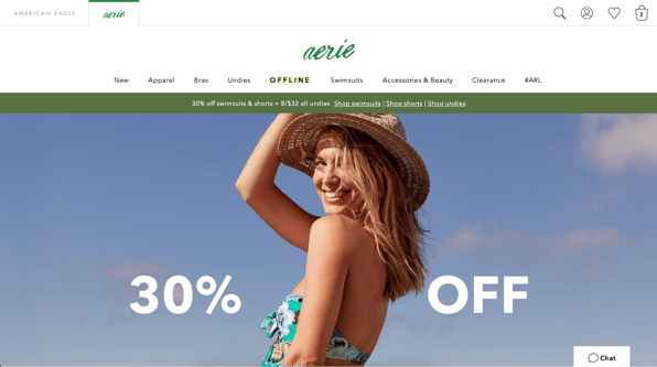
Homepage Advantage
Source: American Eagle
Right away, the Aerie website is doing a whole lot of heavy lifting. But what takes this ecommerce customer experience from good to great before I lift a finger off my trackpad? All of that heavy lifting looks so easy.
This site has a good memory (because I’m not a first-time purchaser you’ll notice my abandoned cart from the last time I was on this site is still intact), is pleasing to look at (even if that gorg model wasn’t front and center this site would be hitting all the aesthetic key points), and includes 3 CTAs that catch my attention without shouting at me (the highlighted “OFFLINE”, the green sales banner, and the 30% off graphic).
The page loads quickly — (use Google’s page speed test to see where you can make quick improvements) — and includes a live chat for customer support on the bottom right of the homepage.
Website Homepage Metrics to Track
- Visitors
- Bounce rate
- Page speed
- Best conversion points (calls to action “CTAs”, links, areas on the homepage)
- Heatmap of clicks and time spent on page
Search Party
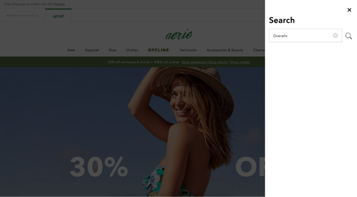
Source: American Eagle
A solid search function can often make or break the online shopping experience. The customer experience goal is to help online shoppers find the products they are looking for as easily and quickly as possible, an intuitive search function is key here. While Aerie’s search feature is prominently featured on every page, it isn’t as intuitive as I’d like.
See all that white space under my search for overalls? To capitalize on each moment of the customer experience, white space should be extremely limited. Instead, this search feature could incorporate suggested products based on my search as I’m typing to make it all that much easier for me to get to a product page.
Website Search Metrics to Track
- Top searches
- Customer support tickets related to website search
- Incorporate quick surveys on your ecomm website and ask about search
Get Results
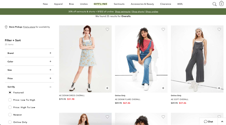
Source: American Eagle
On the landing page for my “overalls” search, Aerie is stylistically as consistent as ever. The simple design is easy on the eyes and isn’t too pushy. So far I haven’t had to dodge any pop-ups or aggressive offers, instead, I’m being left alone to shop and browse at my own pace. That initial green sales banner has followed me from the home page, but it’s a welcome reminder of more savings to come.
Check out that “Filter + Sort” section on the left side. It is user-friendly and couldn’t be easier to navigate. The “Sort By” tab has already been pressed, allowing me easy access to the fan-favorite “Price: Low To High” button.
Product Browsing Metrics to Track
- Most used filters
- Requested filters from support tickets
- Best practice and inclusivity in the category selection
Product Pages for the Ages
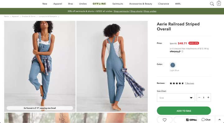
Source: American Eagle
Now on the product page for a pair of overalls that caught my eye, my eye is immediately drawn to the discount on my product. That bright red “Save 25%” button is almost enough to convince me to add to bag. But first, there is so much to take in on this page. The copy and design are still clean, but bordering now on the overwhelming. With 3 lines of links running horizontally across the top of the product page I almost have too many choices on how to proceed, the green sales bar staying up top as I scroll down the product page doesn’t help this cause.
Product Page Metrics to Track
- Most clicked pictures leading to sales
- Time spent on product pages
- Heatmap of time on page and activities
- Product page view to sale conversions
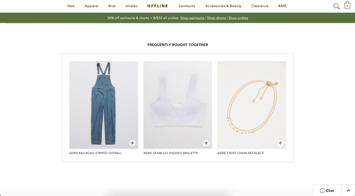
CTA All Day
Source: American Eagle
Further down the product page, I am greeted by a simple and effective CTA. “Frequently Bought Together” sections are always a good idea, they act as a gentle nudge toward more shopping. But what I love so much about them is that they hint at community. This particular CTA reminds you that by shopping at Aerie you are a member of a club, a club of fashionable and— dare I say— chic members!
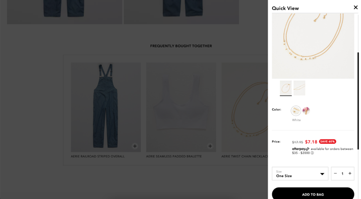
Source: American Eagle
The icing on this CTA cake comes after clicking the plus sign on one of these featured products. Instead of disrupting my shopping experience completely by navigating me to the full new product page, Aerie has the wherewithal to make it as easy as possible for me to add this new product to my cart with this superimposed quarter page. In seconds I’ve added the bracelet to my bag and I’m right back to shopping.
The Reviews Are In
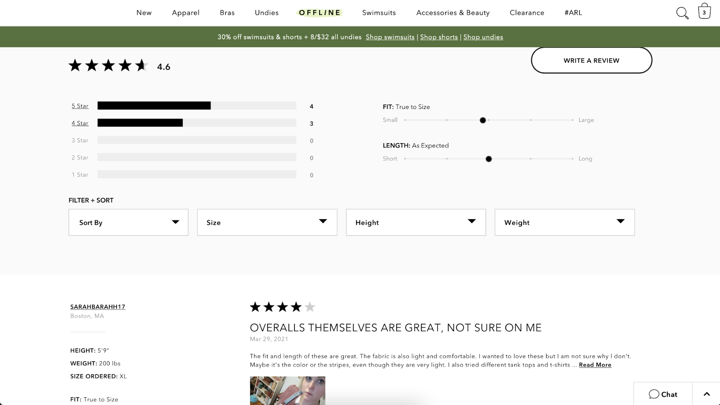
Source: American Eagle
Ahh, the Aerie review section. My home away from home. I’m notorious for believing product reviews and oftentimes won’t purchase something if it has zero reviews on it. A thorough review section is an ecommerce secret weapon— the more detailed, the better. Here’s every detail that joins together to make Aerie’s review section so unstoppable:
- A star rating system
- Sliding scales for Fit and Length
- The ability to sort reviews by rating, recency, or the size, weight, and height of the reviewer, and posts with photos
- The option for reviewers to include photos
- The option to rate reviews on helpfulness
- The “Write a Review” button CTA
I mean, is there anything info that this review section doesn’t have that customers could need or want? I guess a “mood of reviewer” signifier could be useful, to weed out any reviews written by grumpy people. But hey, who among us hasn’t had a bad day and taken it out on a customer review?
Product Review Metrics to Track
- Number of reviews by product
- When are customers most likely to leave a review? Where? How?
- How often and when are you asking for a review?
- Review sentiment by product, price, or category
Chat Sesh
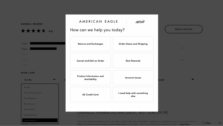
Source: American Eagle
Before we head to checkout, let’s check out a stealth hero of ecommerce sites everywhere: the chat feature. The Aerie Chat, a button on the bottom right of every page on the American Eagle and Aerie site, is a peculiar one. Personally, I’m a sucker for ecommerce sites with live chat functions. But instead of allowing you to talk directly to a customer service rep, Aerie thinks it knows the answer I’m looking for and demonstrates that to me by providing me with some guiding FAQ-type buttons.
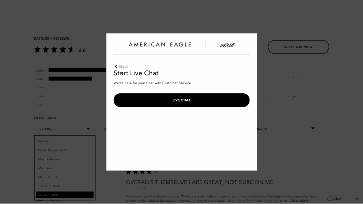
Source: American Eagle
Thankfully, Aerie is intuitive enough to know that sometimes all a shopper needs is some good ole’ fashion one-on-one with a real person. Just three clicks after you hit the initial chat button on Aerie’s site you are able to instant message with a delightful rep, making it easy for you to subtly ask if these overalls come in long or ever will all while sitting on a work Zoom and no one’s the wiser.
Live Chat Metrics to Track
- A most popular time of day
- Length of chat
- Common topics might lead you to areas you can improve your customer experience
In The Bag
Source: American Eagle
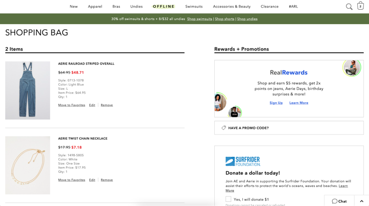
Sold by the positive reviews and sweet discounted price, I’ve selected my size and added those overalls to my bag. Along with the bracelet that caught my eye earlier on my mission, I’m ready to checkout.
Before I can check out I have to review the products in my bag— a step designed to provide ecommerce sites opportunities for upsells, promotions, and additional CTAs. Aerie skillfully hits me with “Rewards + Promotions” that I’m forced to scroll past to get to the “Proceed to Checkout” button.
Shopping Cart Metrics to Review
- % of abandoned carts
- % of carts people return to after abandoning (either based on reminder emails/alerts or without intervention)
- Conversion by device type (mobile vs desktop, shopping via the app or website)
- CTA clicks/conversions within the shopping cart
- Payment type (credit card vs PayPal vs Shoprunner vs Apple Pay)
Source: American Eagle
This is a page that all shoppers must visit before they can complete their order. And Aerie takes advantage of that truth by incorporating a last ditch effort to get me to their sales page, and back into the depths of their site. Not this time, Aerie!
Check (Out) Please!
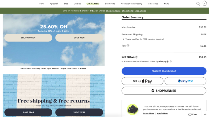
The checkout page for Aerie is a standard, no nonsense form page designed to steer customers to the finish line as swiftly as possible. But hold the phone, I’m more interested in what Aerie does with the otherwise empty space at the bottom of the checkout page.
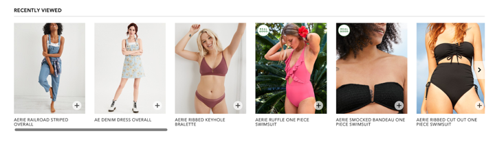
Source: American Eagle
A “Recently Viewed” section can be a crucial tool for enticing upsells, with very little effort. A scroll-like this one on Aerie’s checkout page— with aesthetically pleasing graphics, clean copy, and that signature box design that we’ve grown accustomed to— can be the kick in the cart that your shoppers need to add just one more thing before proceeding to checkout.
Hot tip: Once you design a “Recently Viewed” or “Frequently Bought Together” section like this you can slap it anywhere, they don’t need to be reserved to the checkout page.
Order Placed
As soon as I place my order, I immediately receive an email that my order is confirmed with a confirmation number, detailed information about the status with an estimated shipping date, and a survey to help them improve their shopping experience.
Order Shipped
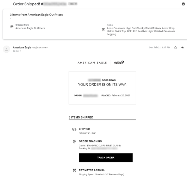
Once my order shipped, I received another email (for those with a critical eye, this came only one day after I placed my order!)
This email includes:
- Tracking information
- Return information
- CTAs to chat or get support
- An order summary
Wonderment offers order tracking for Shopify with detailed order updates, beautifully designed update emails, and reporting/analytics. Your customers will never have to send another “where’s my order?” email again. Try it for free →
Order Received
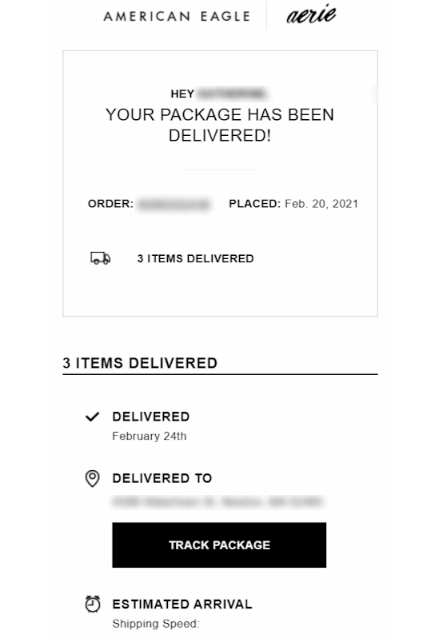
American Eagle has insanely fast shipping (even without paying for a rush) and I received my items only 4 days after ordering. On the day of delivery, I got this email (much like the Wonderment order update emails with Klaviyo) confirming the arrival and offering to chat with support as well as a CTA for more shopping.
Shipping/Order Status Email Metrics to Track
- Open rates
- Click rates/click-through rates (CTRs)
- Bounce rates
- Clicks/heatmap within the email
And just like that, the audit is done! Take the data you’ve collected and use it to optimize your ecom customer experience. If you’re not at a point where you have a lot of data yet, use surveys to ask your potential customers how you can improve.
Looking for more inspiration? Check out the Top 10 Shopify Brands Delivering Great Ecommerce Customer Experiences.


.svg)
